
These are my poster for my PSA. My PSA was on supporting senior sports.
 This poster was my favorite out of the three that I made. For this poster I chose to portray an image of the new Mercedes Benz E350 Convertible. This car is a new design by Mercedes, and it is the first time that an E-Class has been modified into a convertible. In my image I started off by cropping the car, and once that was completed I added an effect that would dim the gloss that the car previously had. Once my car was completed I added my background in, and used the gradient tool to create the red and violet colors. After I chose my colors I found an image of a suitable texture on the internet and placed that into the background. After modifying that image to perfection, my background was completed. For extra details in my poster I added in two Mercedes Benz logos. One of the logos is much smaller than the other, and both have different levels of opacity. The one logo that is larger and has a lower opacity creates a feeling of depth on the picture plane and complements the red from the car in a nice manner. One last addition detail that I added onto my poster were the two lines at the bottom of the poster. These two lines compliment the violet in the background and also add depth to the picture. After all details were completed I added in a suitable text, and my poster was completed.
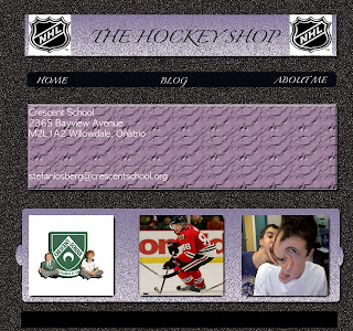
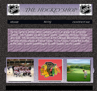
 To create all three of these templates, i started off by using on black background, then distorted it to create the effect of it. After creating the background i would add in rectangular boxes, and more boxes around that for pictures, and for text boxes. After the templates for each individual slides were created ii added in all my pictures, and text and then made some final touches to the templates. I made my template as a hockey based design because i really enjoy playing and watching hockey, and i thought it was one of the best things that suited me, and my personality.

 For this image, at first i found the original picture of the Chicago Blackhawks logo, and then put that into photoshop. For me to add this effect onto it i clicked filter, and once in filter i clicked onto Artistic, and under the subtitles of it, i clicked onto Plastic Wrap and that gave me the effect. The reason for why i chose this pictures was because that the Chicago Blackhawks are my favorite team in the Nhl.
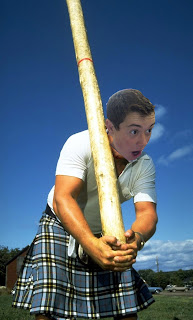
 For me to create this picture, i first started out by selecting the orignal photo of the man carrying the wood, and then added in the photo i made of me on photoshop. Some tools i used to crop the photo of me onto the body were the; magnetic lasso tool, the magic wand, the move tool, and the free transform setting in order for my face to perfectly adjust to the body. I chose this picture because i feel that it was done well, and that it is funny to look at.
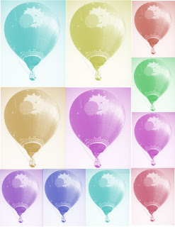
 For this picture here, it consisted of mainly the original picture, and then using the stamp tool, and changing the color effects on the smaller sized photos. Also, i had to use the propose a stamp tool by first saving the picture, and then when i had the stamp clicked i would choose what image to select and in the image i chose the hot air balloon.